Clinical Experience Summary
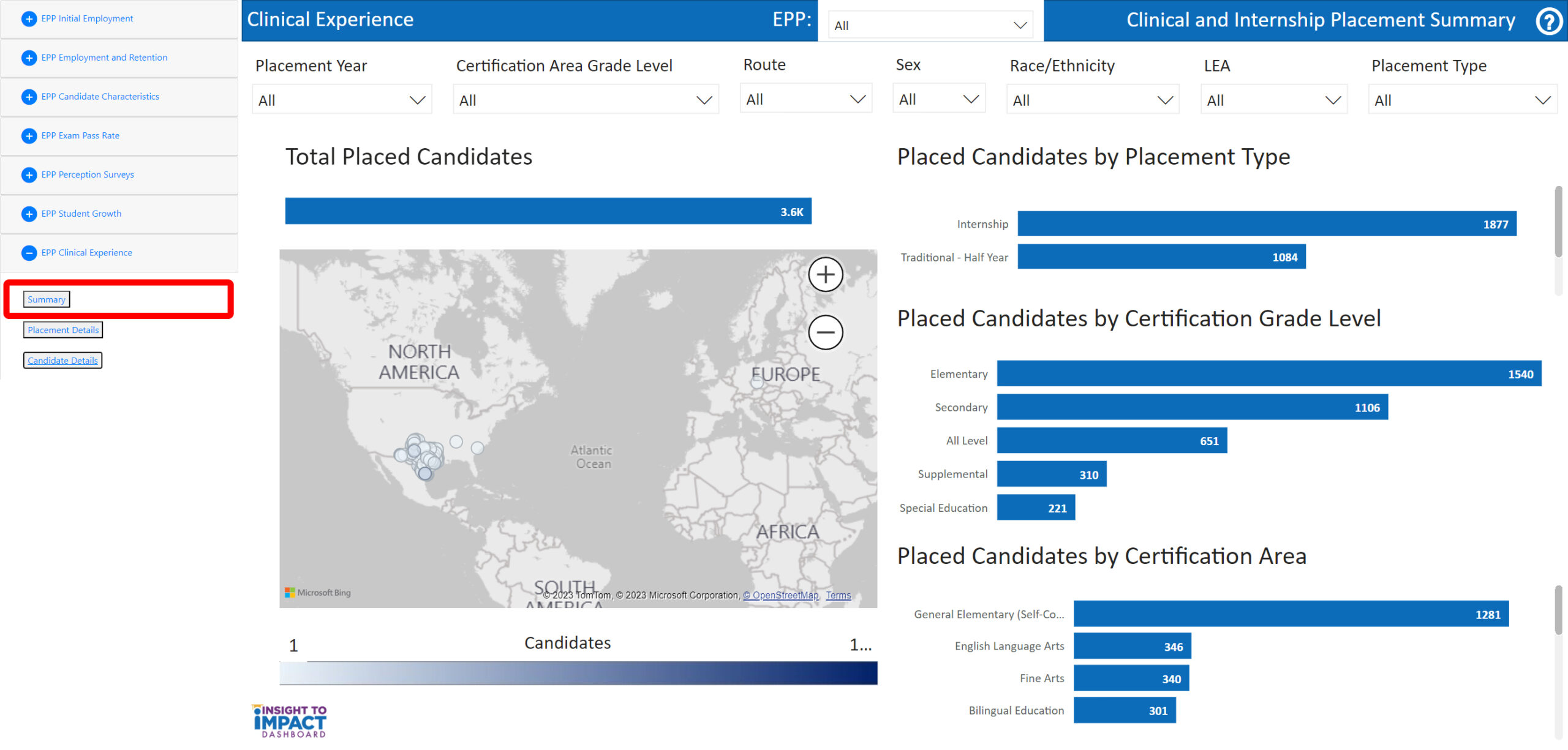
Navigate to the Clinical Experience Summary Page
Select the “Clinical Experience Summary” page from the menu. On this page, you will be able to filter information by Placement Year, Certification Area Grade Level, Certification Route, LEA, Placement Type, Race/Ethnicity, and Sex.
View Total Placed Candidates Map
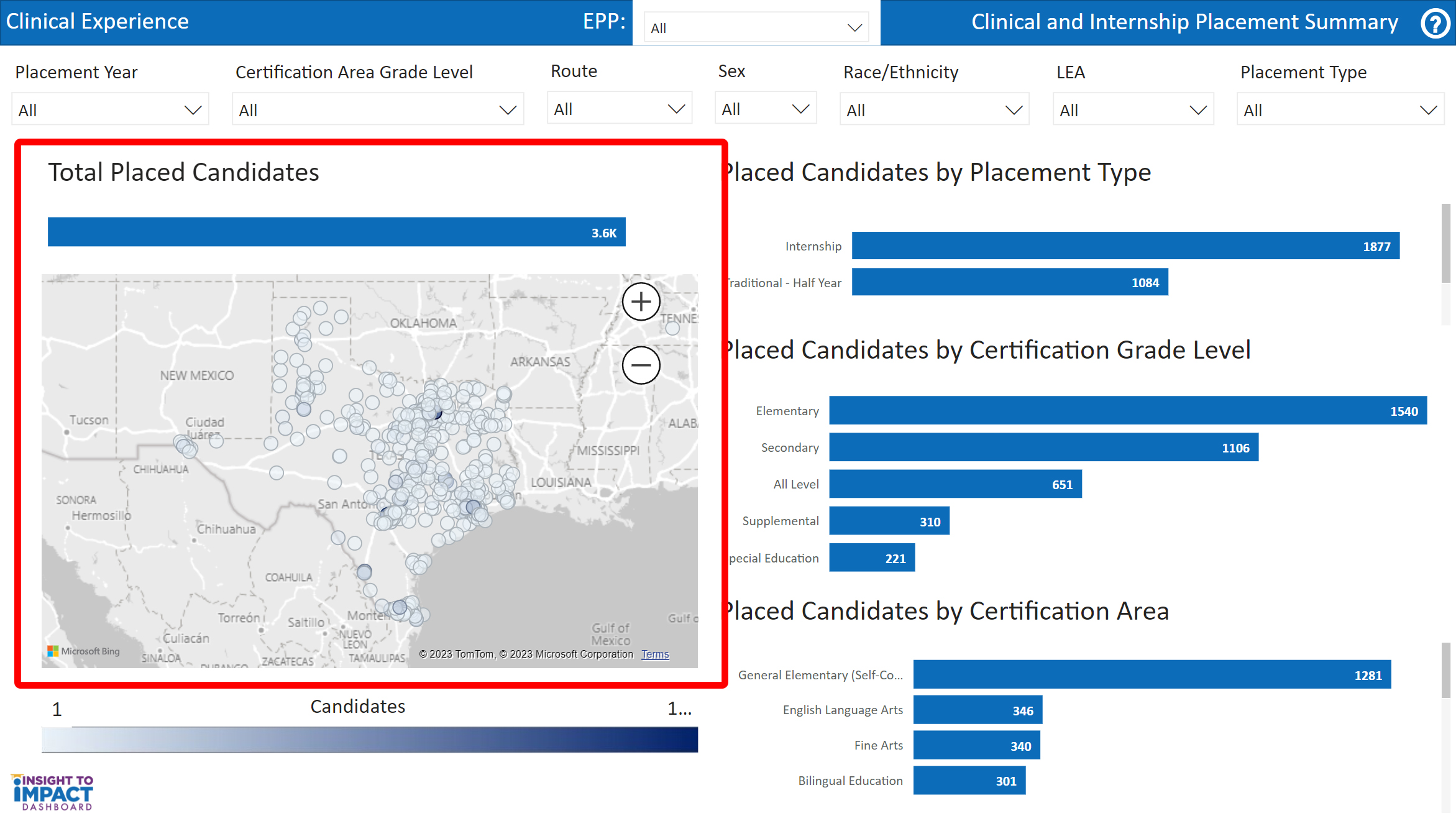
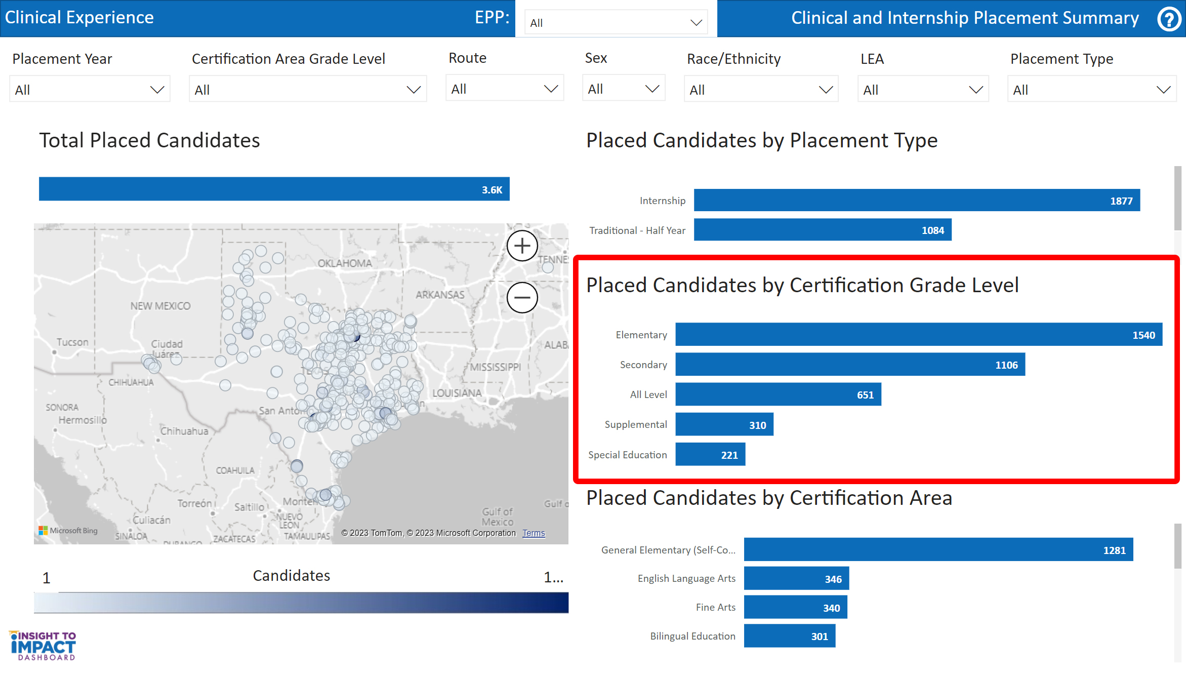
- The first visual is titled “Total Placed Candidates.” This map indicates the location of LEAs where candidates are placed from your EPP. This view will change based on your selected filters.
- Click on the “plus” icon on the map to zoom in. Use the “minus” icon on the map to zoom out.
- Click and drag your mouse to move the map in the screen window.
- Hover over the markers on the map to view the LEA name, address, and number of placed candidates in the LEA from your EPP. In the example below, the map is zoomed in to Palestine ISD.
- Select “Drill Through” to view the “Placement Details” and “Candidate Details” options.
- The “Placement Details” option will open a table view of the LEA, number of candidates placed, LEA demographics, percent of beginning teachers, and a link to the LEA’s TAPR report.
- The “Candidate Details” option will open a table view of the candidates and their placement year, gender, race/ethnicity, certification grade level, placement type, link to the LEA’s TAPR report, and the name of the candidate’s supervising teacher.
View Candidates Key
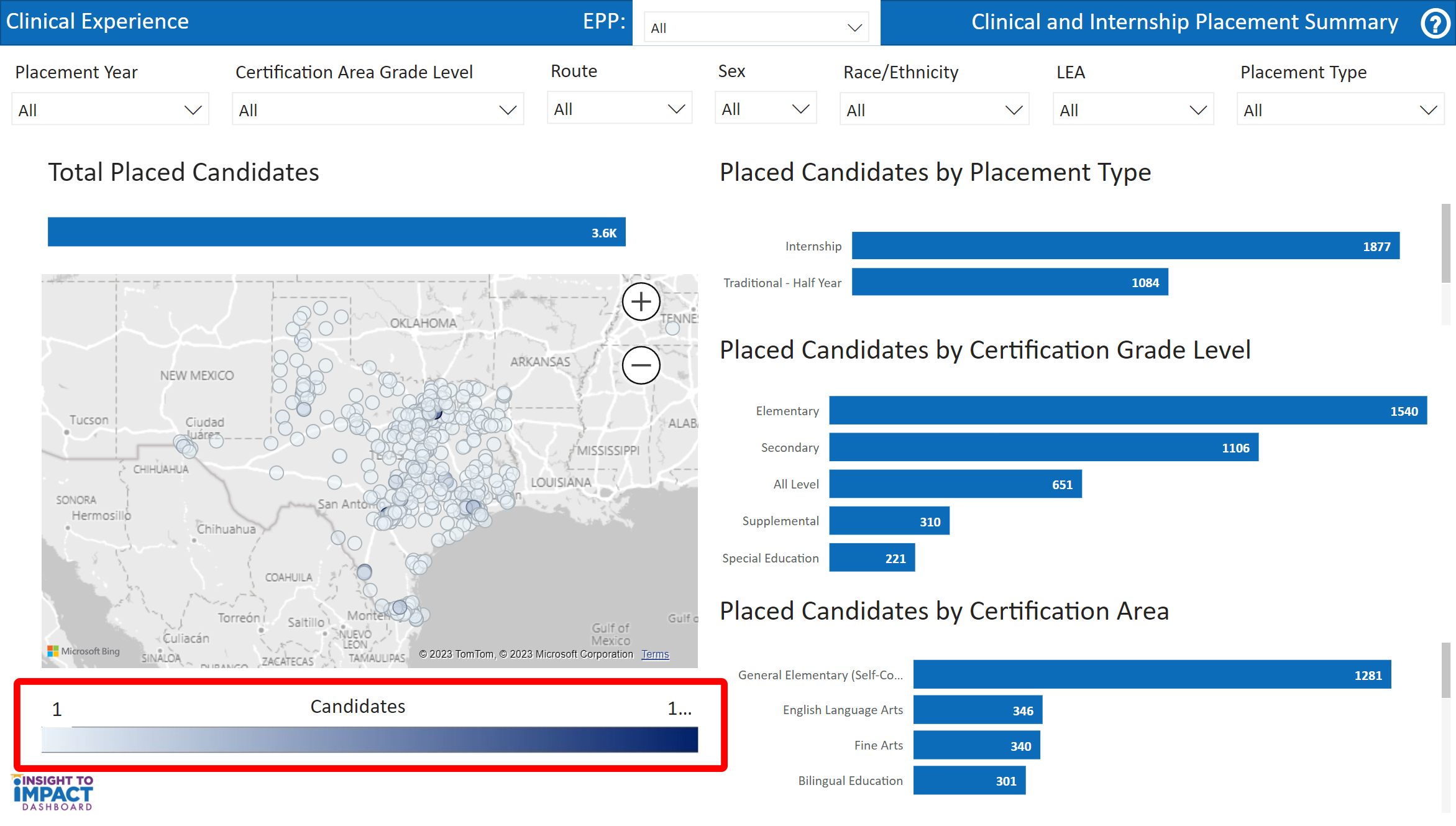
The second visual is titled “Candidates.” This key shows the gradient for the map. The lightest color will display the smallest number of candidates placed at an LEA from your EPP. The darkest color will be the largest number of candidates placed at an LEA by your EPP. This view will change based on your selected filters.
View Placed Candidates by Placement Type Graph
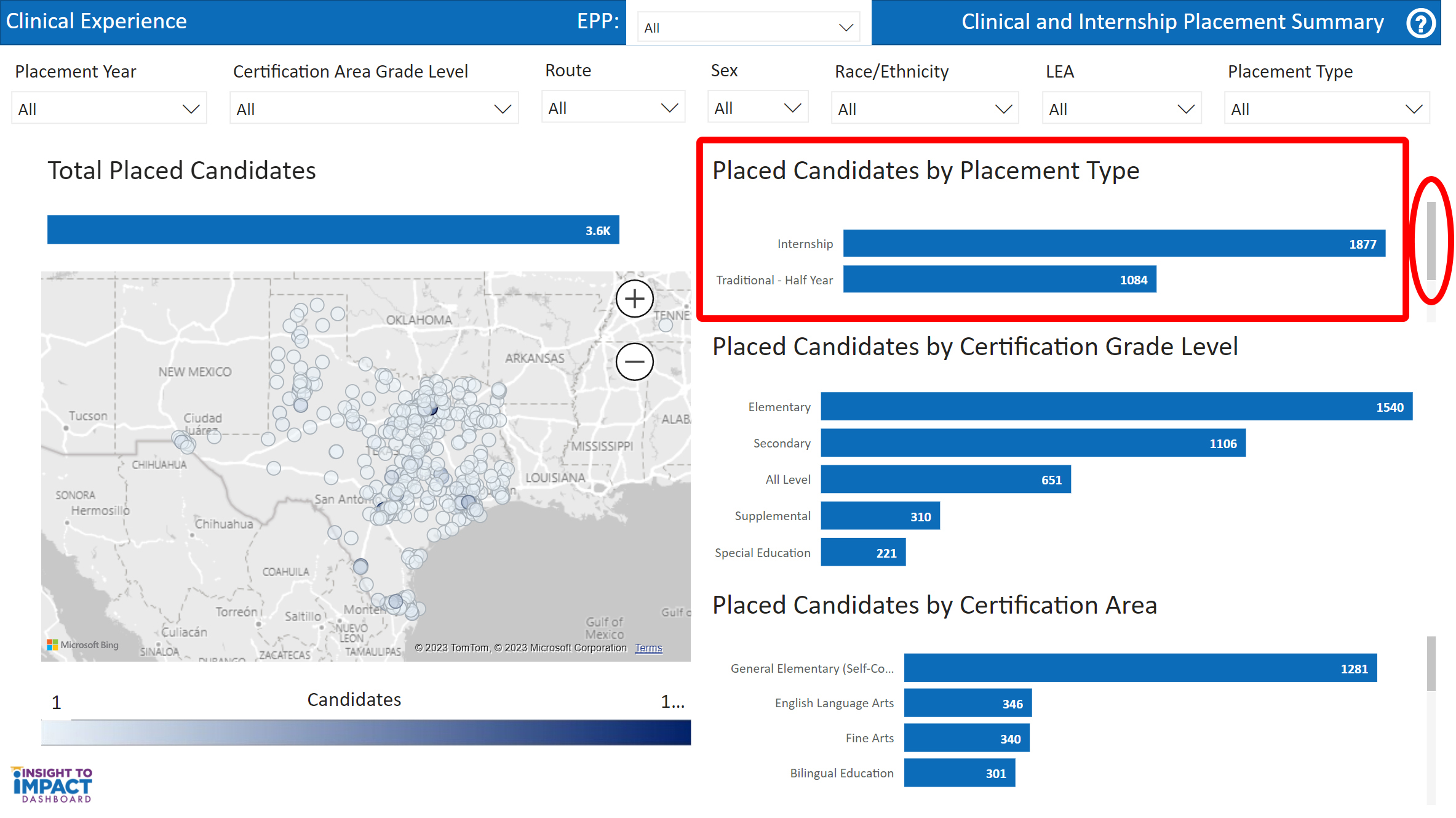
The third visual is titled “Placed Candidates by Placement Type.” The bar graph indicates the number of candidates placed from your EPP as interns, traditional-half year, or traditional-full year. You may need to use the scroll bar on the right to view all of the placement types.
View Placed Candidates by Certification Grade Level Graph
The fourth visual is titled, “Placed Candidates by Certification Grade Level.” The bar graph indicates the number of candidates placed from your EPP by grade level.
View Placed Candidates by Certification Area Graph
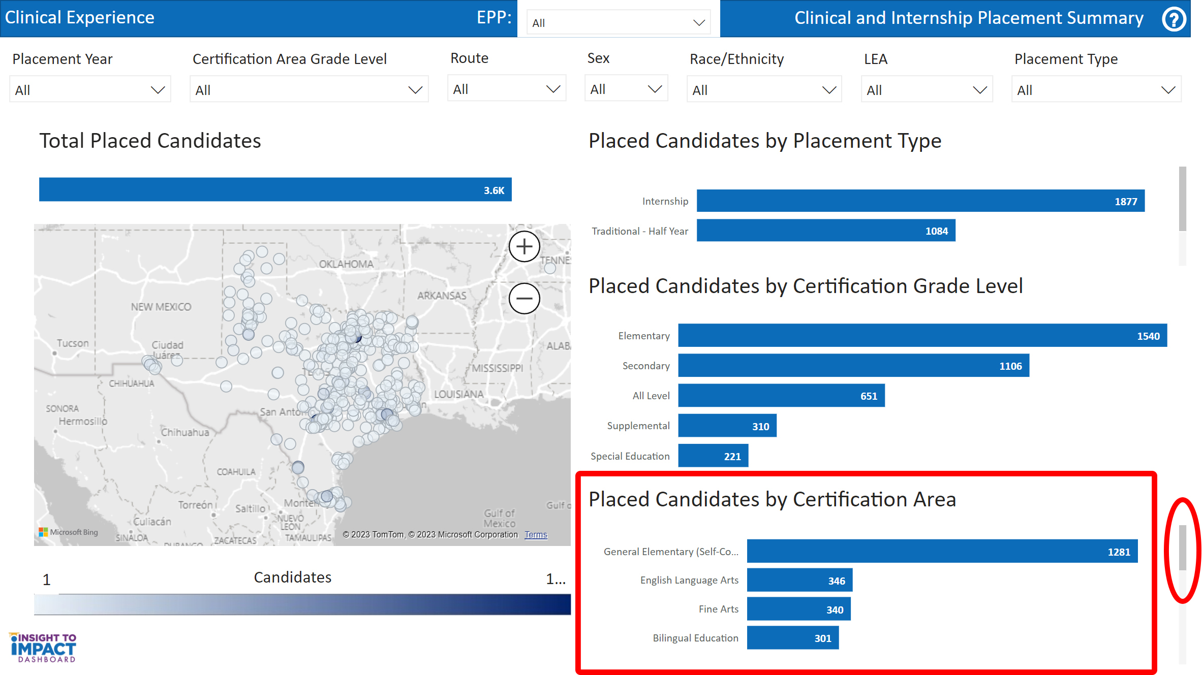
The fifth visual is titled “Placed Candidates by Certification Area.” The bar graph indicates the number of candidates placed from your EPP by certification area. You may need to use the scroll bar on the right to view all of the certification areas.

